If I had more time I would definitely like to adopt the style of using a palate full of colours, add a key and divide maps into categories and maybe introduce some new features, something to do with typography. It would surely give a more interesting and new-fangled look.
I feel the coding of the websites requires a quick clean up. The code side appears to be pretty messy as I was testing and trying different styles and layouts to see which suited best and later didn’t get time to go through the details.
I see this project as a result of my educational interest and daily experiments. For some users the navigation and understanding of the site appeared easy and straight forward however some seemed baffled cause the site is divided into some educational and some experimental maps. From time to time I have tried my best, adding all the missing links which would help user follow the site.
Sunday, 12 September 2010
Digg Labs - 365

365
Digg's application presented by McDonald's
There is no description on the application but I assume that its picking up on stories/news depending on dates and time which is being displayed using a connecting calendar.
Saturday, 11 September 2010
Digg Labs - Arc

Arc
Project by Digg Lab
Though stories are arranged using ARC I think this works great as a site map. The loops connecting to relevant sources. Visually its very attractive and stories keep on adding up, adding more colour and loops to the centre. One of my favourite applications.I find the idea of connecting content within each other the most exciting things.
Friday, 10 September 2010
Newsmap
Newsmap is an application which picks up Google news and reflects visually.
“Google News automatically groups news stories with similar content and places them based on algorithmic results into clusters. In Newsmap, the size of each cell is determined by the amount of related articles that exist inside each news cluster that the Google News Aggregator presents. In that way users can quickly identify which news stories have been given the most coverage, viewing the map by region, topic or time. Through that process it still accentuates the importance of a given article.”(http://marumushi.com/projects/newsmap)
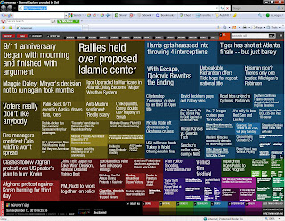
http://newsmap.jp/
I didn’t use much colour in ‘Face maps’ however there is a touch of colour in ‘Descriptive mapping’. On ‘Face maps’ you can see some bold point are rest normal size and this is reflecting the dark features of the face, so where I found boldness in pictures I have highlighted those areas (for example- corner of eyes).
Thursday, 9 September 2010
Digg Lab

Labs Digg - Bigspy/
This is like Digg's own Twitter space. All the feeds are displayed on a page. The hotter the topic, the bolder is displays. Number of digs are shown in red at the end of every story/news. Latest stories are shown on top of the page. The news move so quickly out of screen that I personally find hard to keep track of them. By the time I reach to end of a line its already gone. It's Digg's own live news visualizer.
Tuesday, 17 August 2010


Sunday, 8 August 2010
Mind Mapping

What’s the relationship between brain and mind? Is mental illness physical condition rather than sickness of the soul? Would it be possible to make a complete brain map that tells us different functions of different brain parts and their relationships? It just scares me what we call ‘spiritual experience’ might be actually heavily related to physical conditions of brain.
Rita Carter, 2006, Mapping the mind, http://interactive.usc.edu/members/doox/archives/2006/02/, Date Accessed – July, 2010
Subscribe to:
Posts (Atom)